In what ways does your media product use, develop and challenger forms and conventions of real media products?
For my 5-minute short film and my two ancillary texts: poster and magazine review the first thing I done was to identify the codes and conventions. The reason for this was to understand how these codes and conventions enabled other media products to be successful. By identifying these conventions and then applying them to my own product I would therefore allow my own media product to emulate this success. After I identified several of these codes I planned to use them for my product, however as I started to develop my ideas deeper I found that I could challenge these codes and allow my product to go even further. For instance my short film uses a common narrative found in many short films; a protagonist trying to overcome a problem and in the end either succeeding or failing. I also used a common style of film; a mixture of Silent Film and Film noir. However when I decided to combine the a common narrative of drugs and peer pressure (an issue that is relevant to society) with the common film style that has been used by the likes of Charlie Chaplin and Alfred Hitchcock I was able to produce an unconventional film. These two conventions in narrative and film genres produced an unconventional short film; a silent film/film noir about the effects of drugs use and peer pressure on an individual. This is one example of how I developed the use of these conventions and challenged the way a short film could tell a story.
The image above is from the film Garden State. In the scene it shows a man under the influence of drugs as he watches the events of the party unfold around him. It uses the sped up effect to portray this.
My film draws several parallels with the scene above. I used the sped up effect as inspiration for my film. My film also portrays the idea of observing events will under drugs. Although the effect is similar for both scenes I tweaked mine a little too make my scene go even further then the one from garden State. Instead of keeping the camera stationary for the entire scene I zoomed in and out. This added more to the scene. I also done the sped up effect from different angles and also from Abdul's point of view. This is another example of how I used conventions of one film and developed it further to use for mine.
WIth regard to the narrative my film is similar to Spike Jonze's short film called We Were Once A Fairytale. In We Were Once A Fairytale, the main actor, Kanye West makes his way to the nighclub bathroom. This is done using the blur effect. I used this blur effect for my film. Once Kanye is in the bathroom he throws up and then stabs himself in the chest. My storyline is very similar to this; Abdul make this way to the bathroom, throws up and then dies. However I changed mine so that he doesn't stab himself, but shoots himself. And instead of it happening in real life, he just imagines himself shooting himself. I also film my scene differently with a lot more close ups and lower angles.
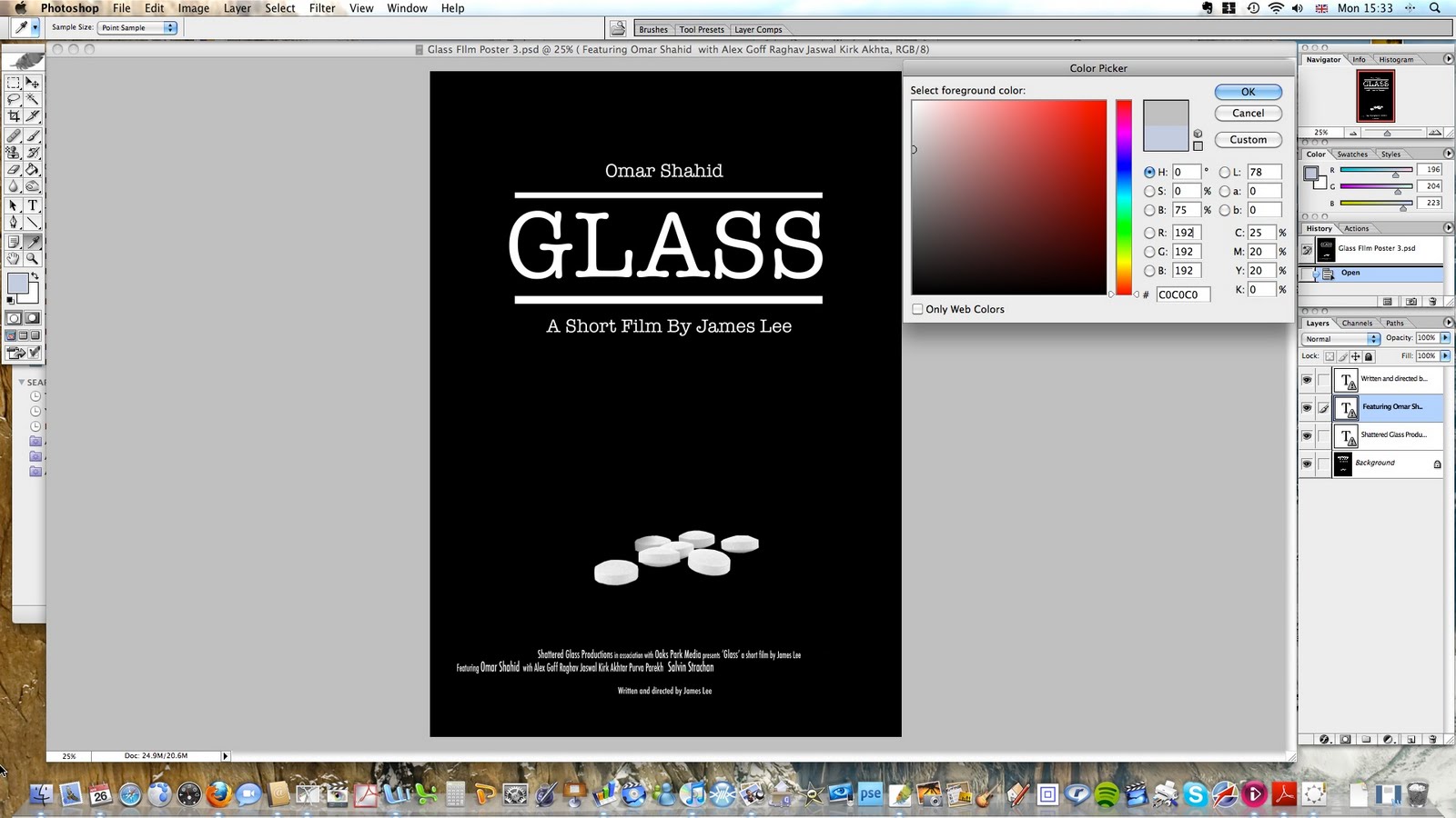
For my film poster I researched the codes and conventions. However as I tried to find film posters that were similar to my film, i found very few. Therefore i decided to use an unconventional poster. I liked the idea of a minimalist poster and remembered the poster for Fellini's 8 1/2. I used the convention of this poster to set the foundations for my own poster.
I followed these conventions closely however I didn't want to mimic it fully so I added images of pills at the bottom. My poster is there for a cross between 8 1/2 and Stalag 17. I followed codes and conventions of other posters by adding my name and the main actors name near the title. I also added text at the bottom of the poster which I found was common in all posters. This added authenticity.
For my magazine review I purchased Empire Magazine and looked at the review sections. I identified all the conventions and used them for my review. This ancillary text was not unconventional and was pretty much identical to the actual Empire Magazine review. This included the layout, use of colour, the use of language, quotes etc. The reason why i didn't deviate from these conventions was to produce a review that looked authentic . This was the only piece that i followed all the codes and conventions specifically.
How effective is the combination of your main product and ancillary texts?
I believe that the poster for my film and the film review compliment my Short film fairly well. The poster is a good representation of my film, as its black background, minimal text and picture of pills shows my film to be bleak and very dark. It also shows that it is unconventional and hopefully this will pull my audience to the film. As the poster is black and white, the audience won’t be surprised that it the film is in black and white. I believe that this is important as black and white films are regarded as less interesting when compared to HD colour films or even 3D films. By understanding that the film may be black and white they will know what to expect. However this may have the opposite effect and people may not want to see the film knowing the style that it is in. This is why the addition of the magazine review shows critical analysis of the film and the four star rating reinforces the decision to watch it. As the film has a good review this would help to attract more people to the film then a bad review. All in all the combination of my main product and ancillary texts work well together. What have you learned from your audience feedback?
From my audience feed back I found that most reviews of my main product and my ancillary texts were fairly positive. For my short film the main themes (drugs and alcohol kill, teenage influence etc) were understood. They agreed that the use of black and white was important to the film as was the music, setting, mis-en-scene, lighting and editing. However although majority agreed that the classical music worked well there was some disagreement. The reviews below were gathered form my target audience.
I also asked 25 people who watched the film to give my Film a rating between 1-5. 5 being the highest and 1 being the lowest.
I done the same for my film poster. I asked them to take into account how well the poster worked with the film and if it was a true representation of it.
I repeated this for my Magazine review aswell. I asked them to specifically take into account whether the review looked realistic or not.
How did you use media techniques in the construction and research, planning and evaluation strategies?
Throughout the creation of my media products i used a variety of media techniques. Vimeo and Youtube
Throughout the creation of my media products i used a variety of media techniques. For my research into short films I mainly used two websites; Youtube and Vimeo. Youtube is the most popular of the two and with its large database of videos i was able to view many different short films. However i soon discovered that there wasn't a wide variety of 5 minute films to watch (most of them being Media studies courseworks). I therefore decided to sue Vimeo; a website dedicated to showing short films from animation to documentary. It offered a wide variety of amateur and professional short films for which I could use for my research. Although I primarily used Vimeo for my research, I used youtube to help me in my construction. I used youtube to find tutorial on how to make cheap track dollies and in the end it helped me make the track dolly that i used for the film. I learnt several new techniques on how to use programs such as imovie and Photoshop and even found out about how to make the most out of certain shots. I also used Google, Flickr and other photo sharing websites to research about ym film poster and magazine review Equipment
During the filming of my film, I used different equipment. I used a mini DV Camera. Although the quality was only 1.33 megapixel it was satisfactory for the task at hand. For all the stationary shots I used the tripod. As my film included several tricky shots i had to make my own equipment. This included: a home made track dolly (made out of wheels from a skateboard and cheap wood) and a camera jib ( made out of a single bit of wood with the camera strapped to the middle)
These two pieces of equipment were fairly new to me, however i found that it aided my film enormously as it helped me to achieve the best possible shots.
Imovie,Garageband and Photoshop.
I used Imovie as my main editing software. I decided not to use other more expensive software's such as Sony Vegas as I believe iMovie had enough effects and tools on offer to edit my film.
With the use of Garageband i was able to add multiple sound effects and tracks to my film. The sound effects were already available in the software however i had to download other sound effects from the internet such as the Heartbeat and Rumbling sfx. These were on offer for free in several forums. I also learnt how to use certain aspects of garageband on youtube.
I used photoshop CS to construct my Poster and Magazine review. Photoshop proved ti be an excellent program to use as the different editing options on offer were vast. All though my two ancillary texts were basic and didn't need to use tools such as Gradient or even the pen tool, I had fun experimenting with them. Youtube aided me in tutorials and I also found tutorials on internet forums.
To record all of my creative decisions and progress throughout my coursework I used Blogger.com. This proved to be a more convenient way of recording my research, planning, construction and evaluation.
I used Adobe Photoshop CS to construct my magazine review. I aimed to pretty much follow the Empire Magazine layout. The first thing i done was to find a suitable picture to use. I chose a picture that represented the film. Once i had done this i edited in using the lasso tool, all the borders around the page. I scanned in the 'In Cinemas' bit from an actual Empire magazine that i had and tweaked the colour using the ' colour adjustments tool' to make it look realistic. I used times new roman text for the writing and adjusted teh size of the writing where appropriate. Once i had added all the title, subtitles, basic info about the film I added the colour scheme. I sued the same colours to once again make it look realistic. The last thing i done was to add the review which I had done on Microsoft Word.
As my short film is a fairly unconventional I believe that the best way to represent my film would be to use an unconventional film poster. In keeping with the black and white theme, I decided to keep my poster black and white. My poster draws parallels with Frederico Fellini's 8 1/2.
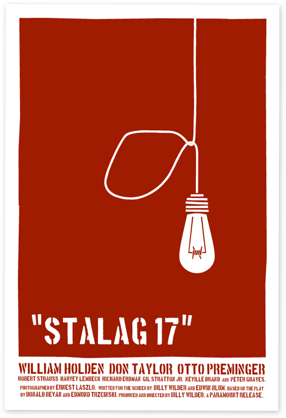
I didn't want to give too much away about the film through my poster. Although film posters are meant to attract the audience by putting the main actors on the front, showing the storyline/ themes etc , I believed that my minimalist approach to my poster would still attract my audience. I wanted to only give away a little information about the storyline and therefore decided to use the picture of the pills. This is similar to Billy Wilder's Stalag 17.
I used ideas from other posters most notably Lars Von Trier's controversial film Anti Christ.
I decided to change the ending of my short film. This was because my original version didn't suggest a definite ending and was left too open. I therefore decided to end it when Abdul is being surrounded by his friends, when lying on the kitchen floor.
I added my footage on to imovie and edited my footage.
For the scenes where I required to speed up the clips (Abdul's drug scene) I altered the clip speed to 2000% For a couple scenes where i slowed down the clip i reduced the clip speed to 50%
I used the Black and white effect on the whole film and also altered the contrast levels on a couple of scenes. I used the 'pull focus' title effect to create the blurred scenes and used 'centered' title effect to create the opening and end credits.
I created the movie score option from the menu on Garageband. I added the Clair De Lune Soundtrack and then added separate tracks to it. These tracks included: heartbeat, transportation sounds (sirens, trains), animals (dog barking) ticking clock etc. I used Garageband as it offered me more editing options and allowed me to add several different sounds at once (something that is limited on imovie)